Role: UI Design
Date: 2020
Company: Cheil Colombia
Role: UI Design
Date: 2020
Company: Cheil Colombia

Essilor application is a proposal for the brand that allow the people involved in the commercial process of the company, for example: optical shops, optometrist and promoters have a good option to earn benefits through their sales.
The first stage in the planning of the app was to understand well the different roles in the process and identify the possible needs and interests of each person, through this research it was possible to find the following insights:
we are thinking on a digital tool for our workers benefits, that would be a solution and a good way to motivate them.
The benefits increases the motivation and allow us a healthy competence.
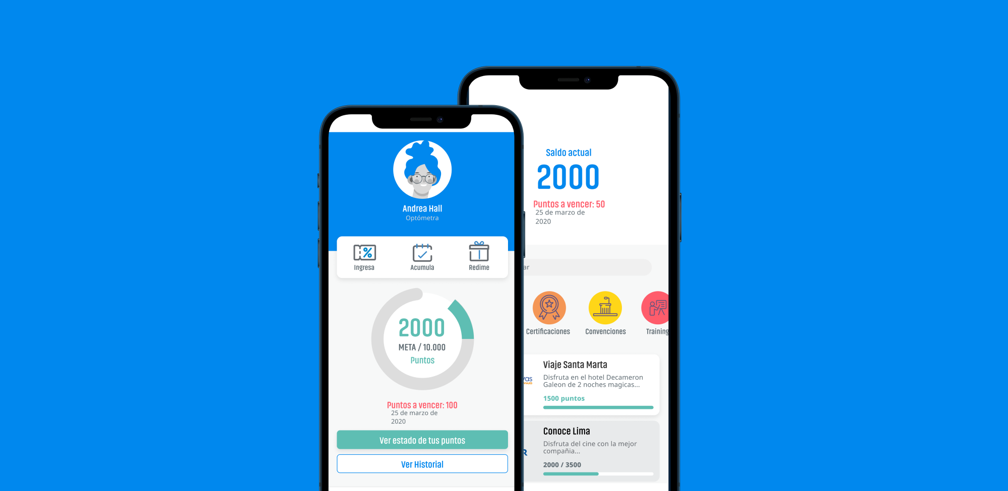
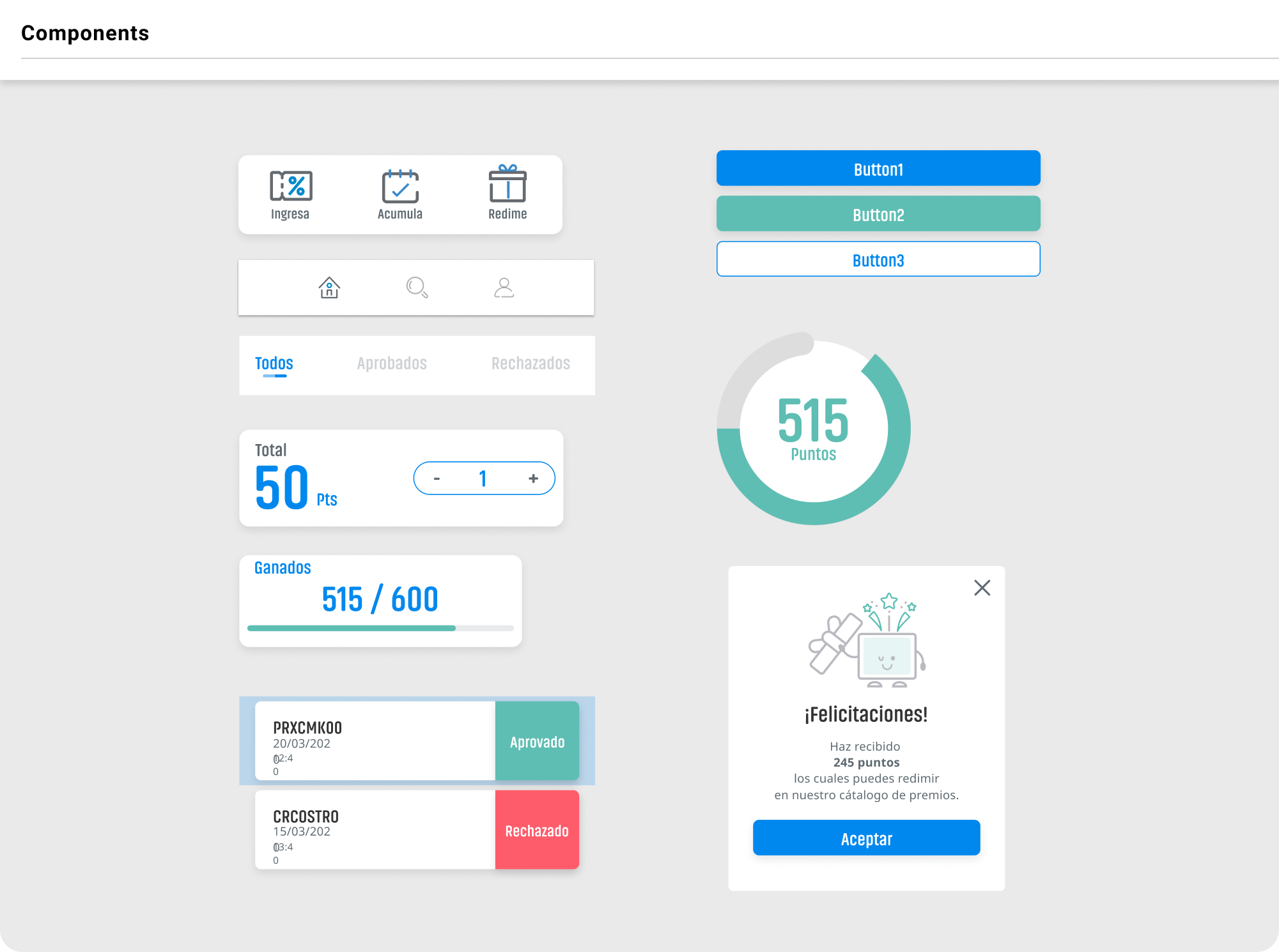
With the research results of the UX team, I identified important information that allowed me to create a basic structure of the app that work for all profiles.

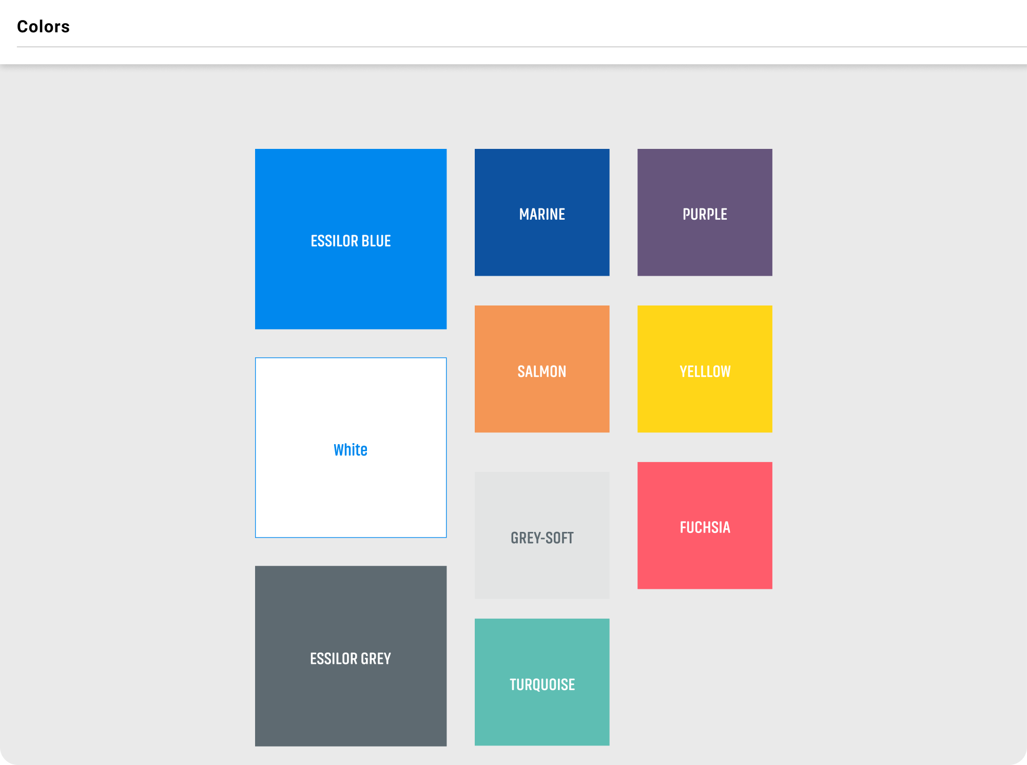
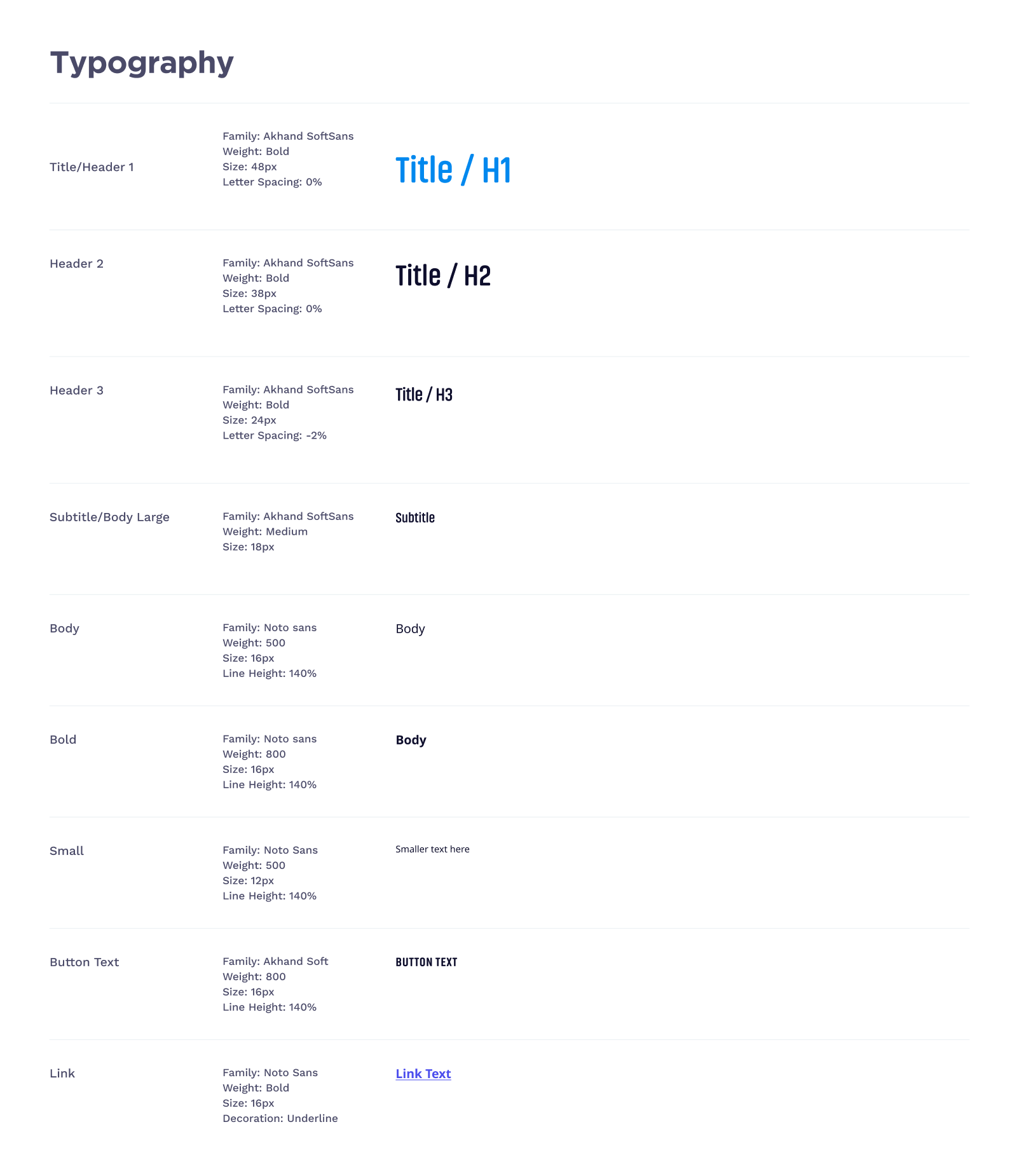
For the design system, I was based on brand values and developed a colour palette that identified the Essilor brand and optical shops environments with a light pattern, the colours were used to provide a differentiation for each profile, also I defined a type scale with the official fonts of Essilor, and used a component library that allow to solve tasks easily.
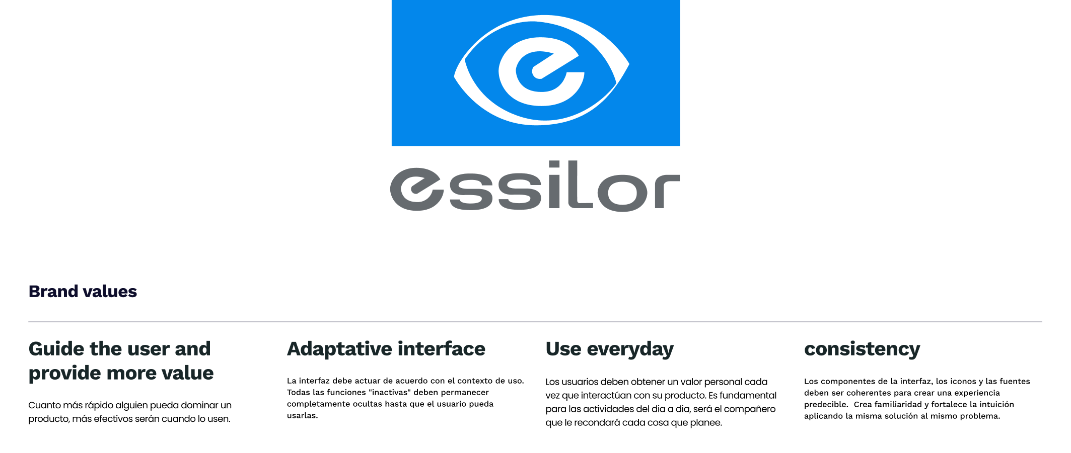
Essilor is a global ophthalmology brand that provide solid solutions in its field, the brand values meet the different goals of the company and look for improved through their digital tools.
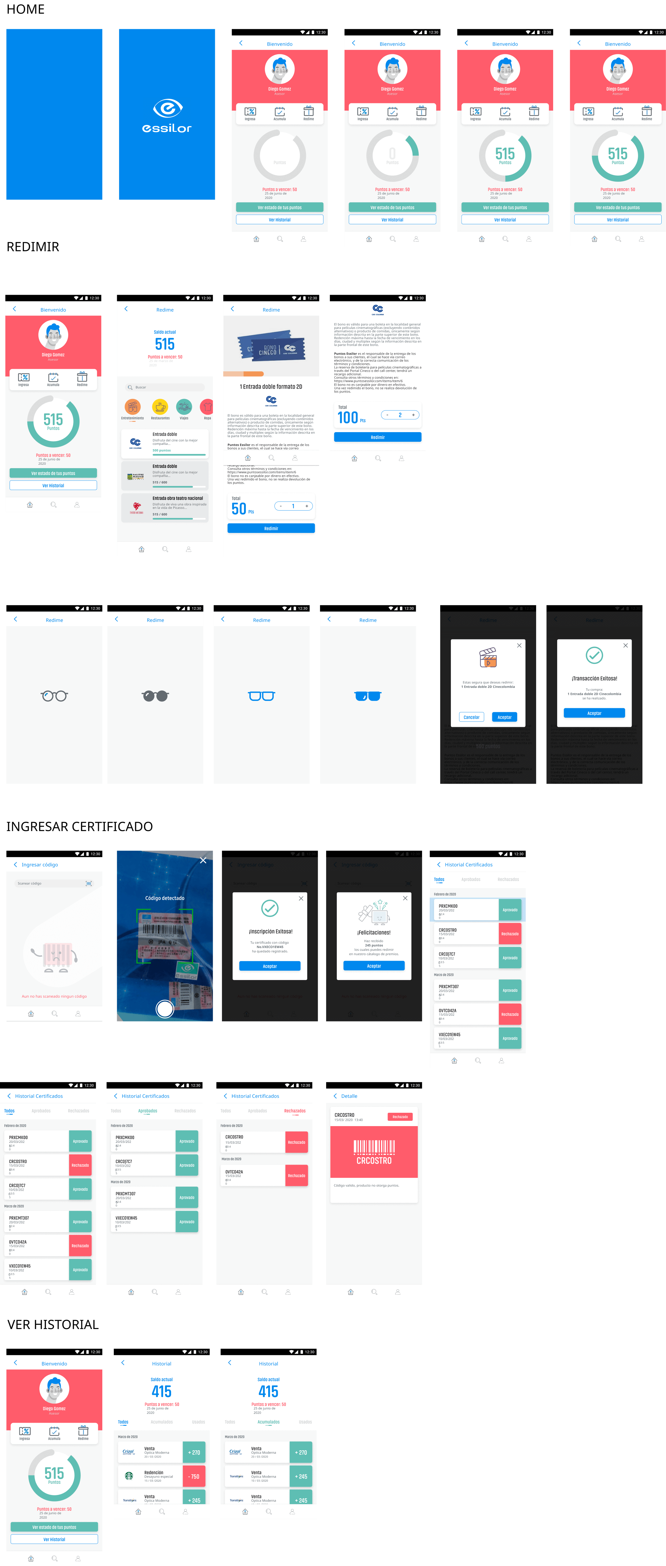
The definition of the scheme colors was based in the current lineup for this category products, the dark mode theme is important also to transmit the quality and sobriety of the new line and design of products.
The imagery and use of illustrations were defined by the goal to represent a platform of redeem and benefits to all participants around the work process for this reason the visual elements respond to with friendly and illustrative characters.
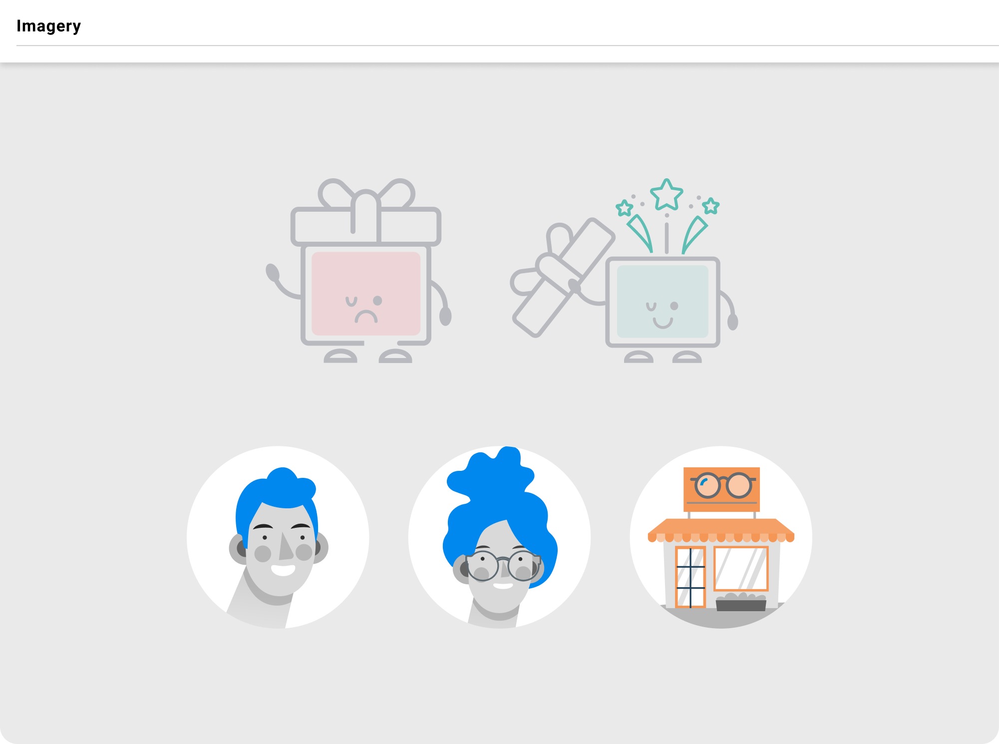
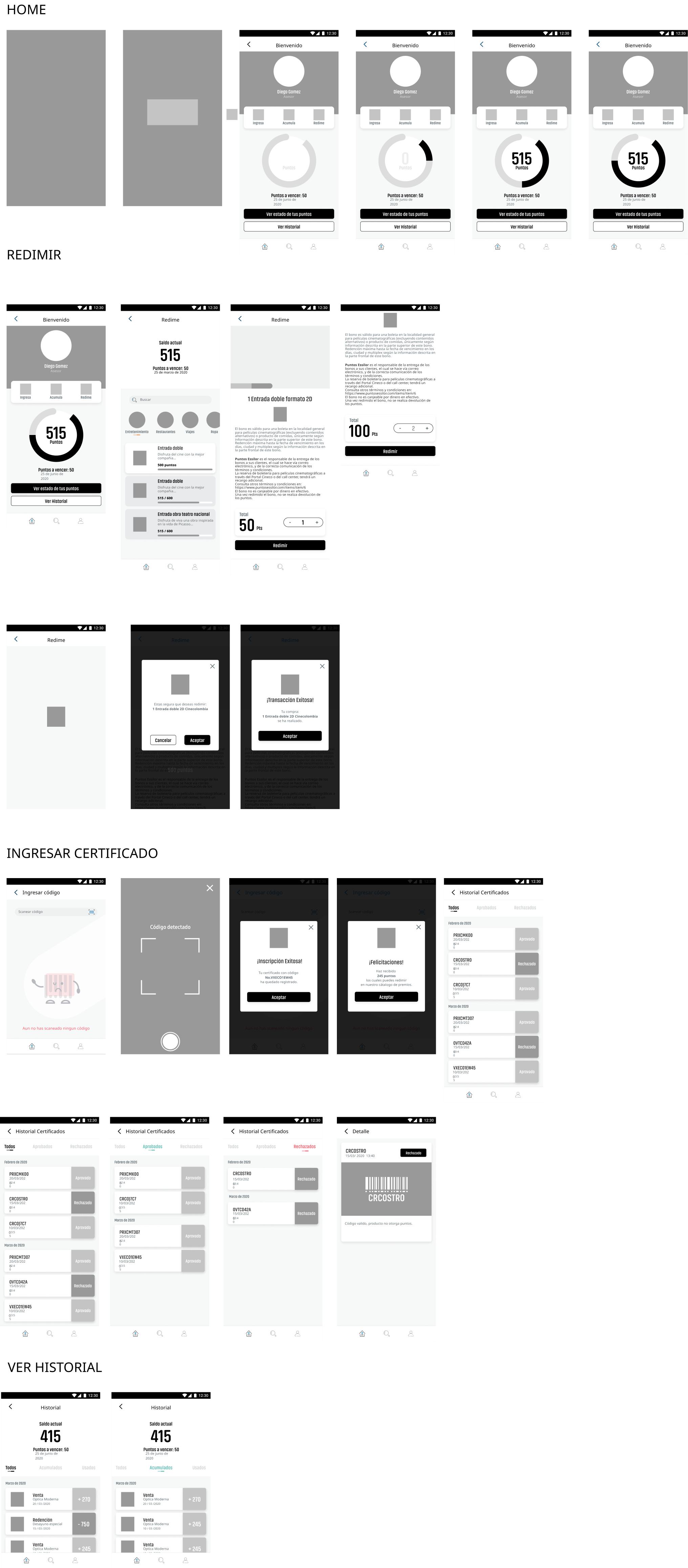
The creation of a components library allowed us to define elements that facilitated the communication with development team and the delivery of assets, in this way the visual aspects of the interface could be consistent with the porpuse, for this reason I create the assets with atomic design methodology.
Finally we presented an Application that solve the primary goal that is promote the space where the participants in this visual care process obtains benefits and learn more about their work.
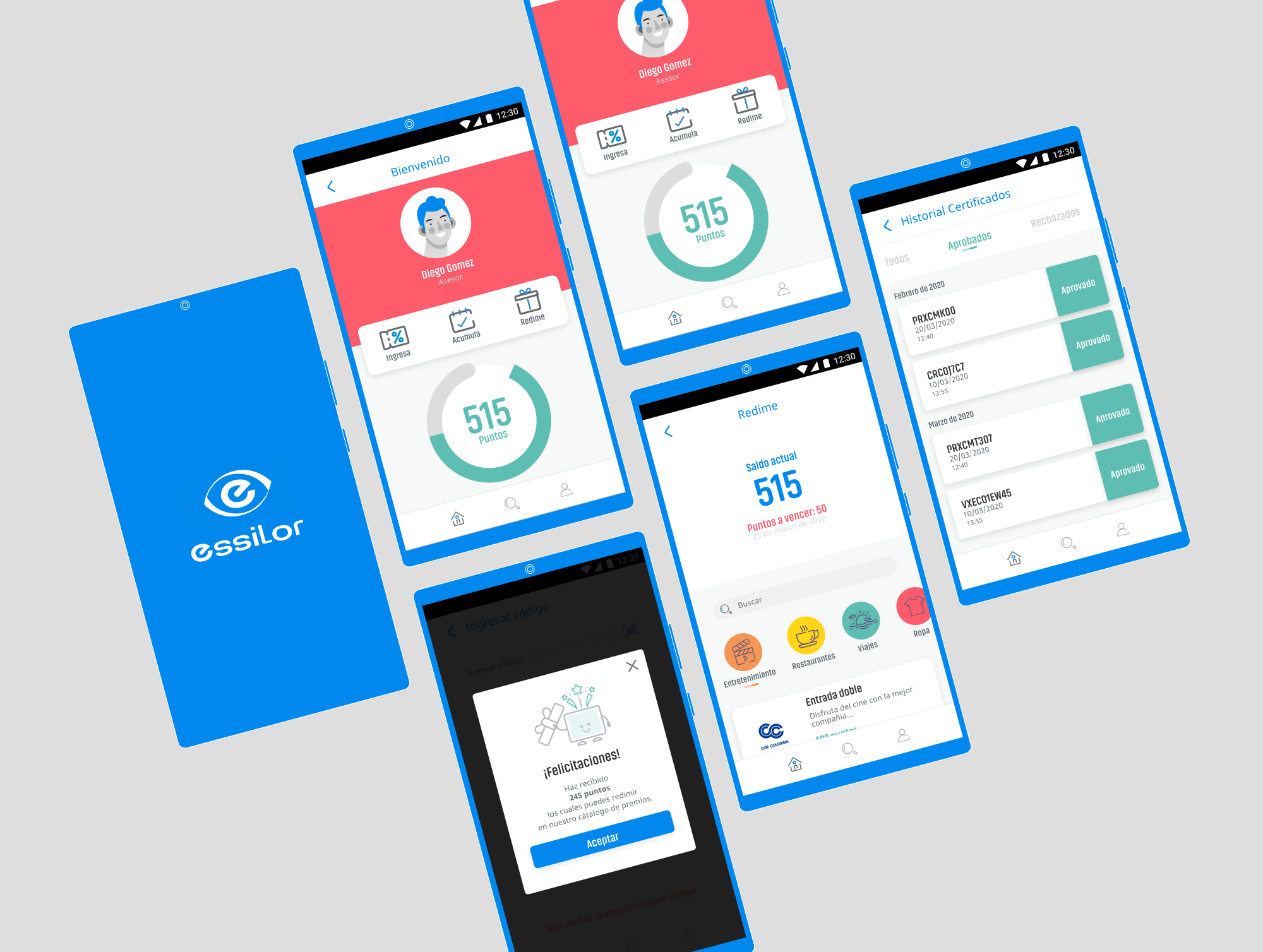
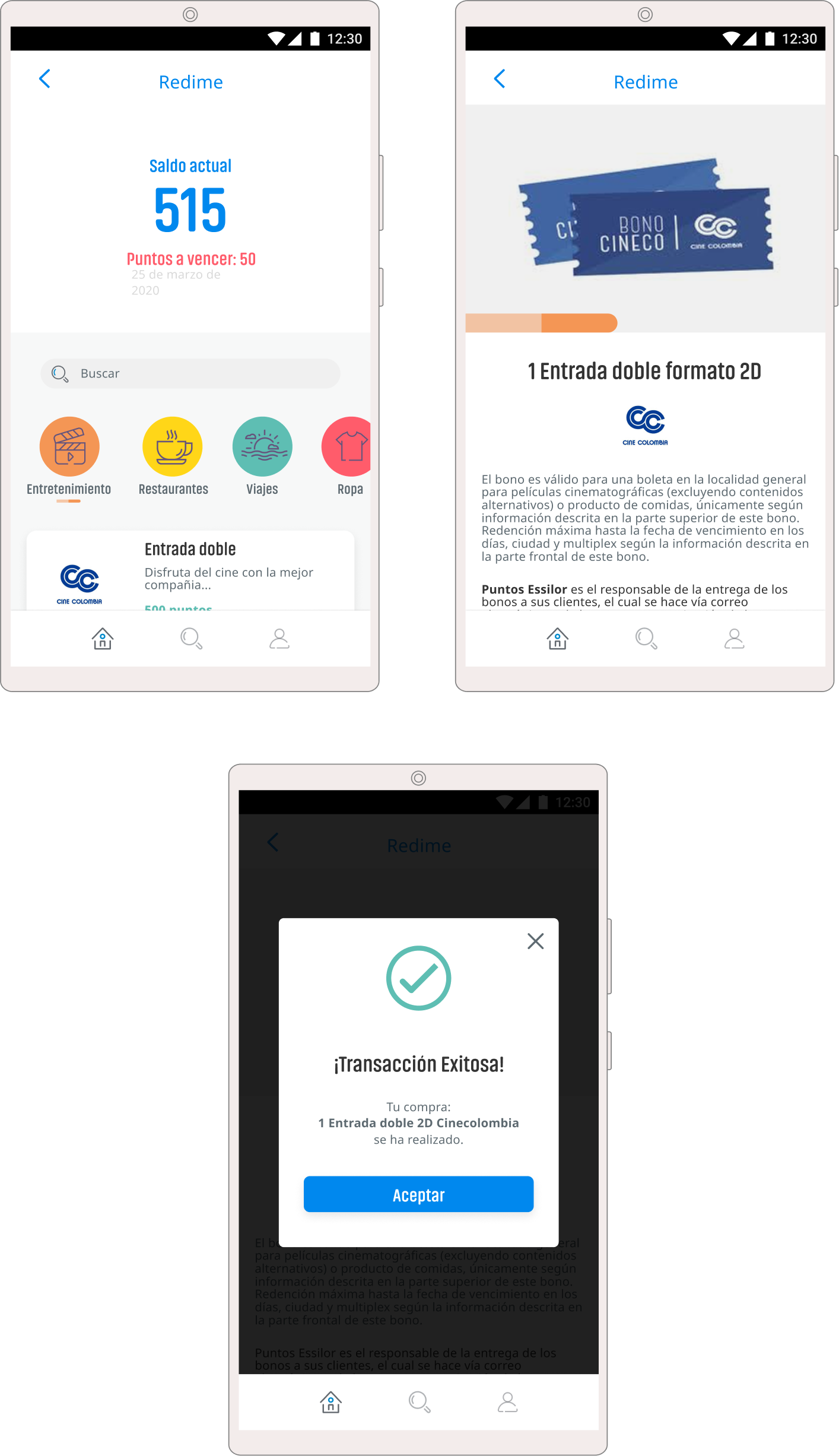
We think on an easy way to check and register new points for each sale, for this reason we use the code scan component that allows to speed up the process and at the same time control the sales of the products.
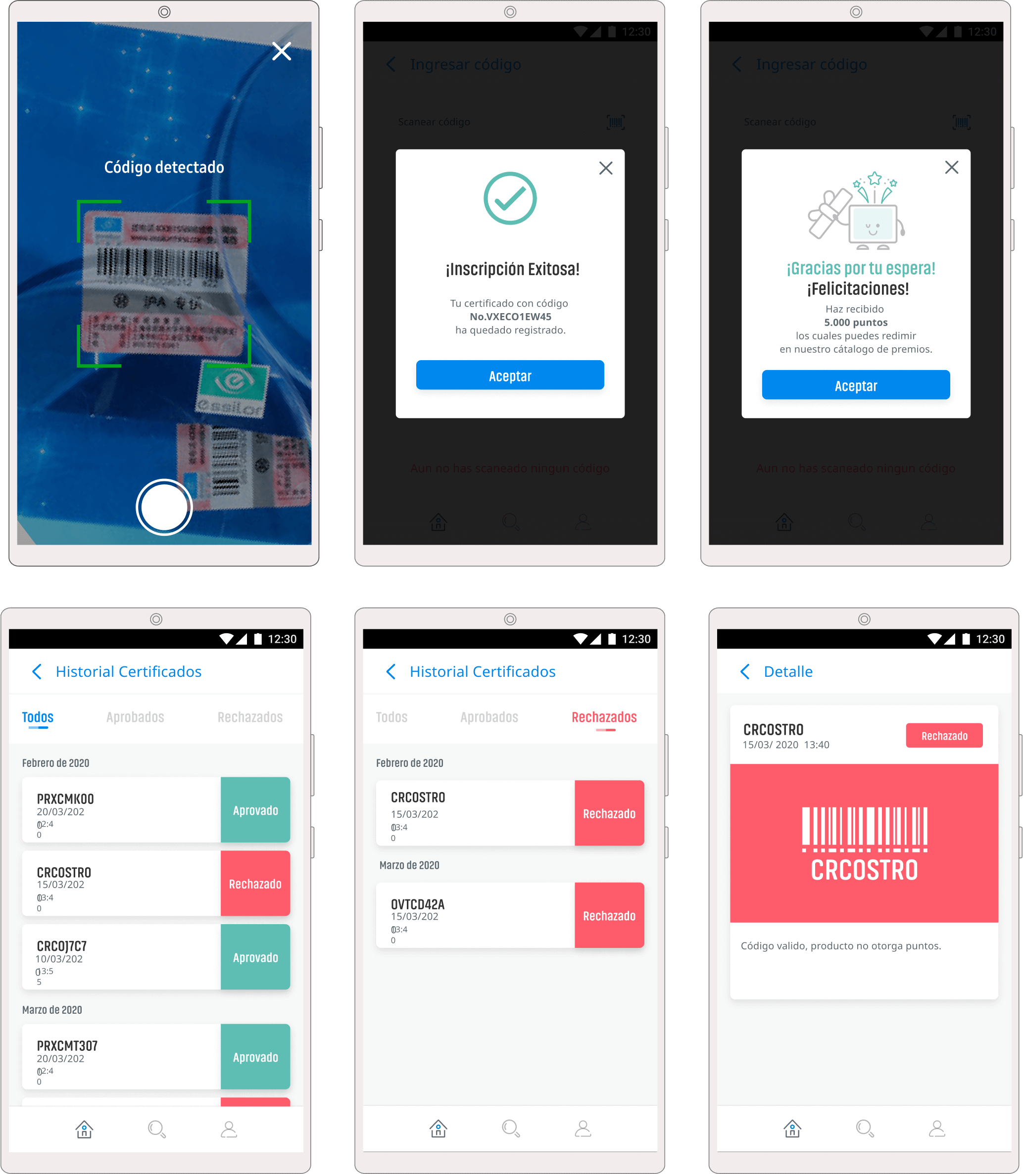
To redeem the points for products we displayed a catalogue with category tabs, based on the points the user is able to change the quantity of products that they want.